2026 Author: Howard Calhoun | calhoun@techconfronts.com. Last modified: 2025-01-24 13:10:34
Gantt Chart is one of the most popular tools for visually illustrating the schedule in project management.
What is this?
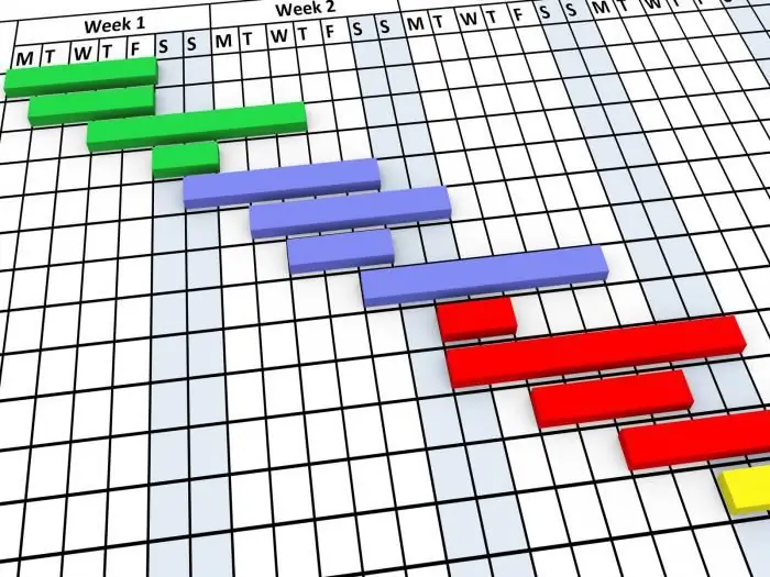
Gantt chart is designed to illustrate the different stages of work in the field of small and medium-sized businesses. Visually, it is a simple set of strips consisting of two main axes: cases and time. Each time period is assigned a specific task that must be completed.
In the diagram, in addition to the main blocks, there may be a special additional column showing the percentage of work completed. Special marks - milestones - are used to highlight two or more tasks and demonstrate the sequence of their implementation.
The Gantt chart is a kind of standard in the field of project management, because it is with its help that it becomes possible to clearly show the structure of the implementation of all project stages.
What is a Gantt chart for?
Given that most people are visual, the diagram provides an opportunity to solve one of the main tasks and show the staff what to work on, what resources to apply in the process and withhow fast to perform certain tasks. All information is presented in a compressed form, without the use of confusing tables and a huge amount of text. At the same time, the essence is clear and understandable to all, without exception, project participants.
Using a chart greatly simplifies the management of small-scale projects and makes it possible to always keep employees' activities under control.
History of the appearance of the first chart
The first chart format was developed and tested by Henry L. Gant in the early 20th century. The scientist was hired to manage the construction of ships for use in the First World War. A special schedule allowed him to coordinate the work of several engineers, controlling the completion of tasks on time. Gant started directly by listing all required tasks and scheduling them according to available resources.
An important stage was the demonstration of the dependence of some tasks on others. In addition, Gant allocated for each person a period of time during which he had to complete a certain type of activity, indicated who and what task would be performed, taking into account the time allotted for the project.
Gantt charting is done using a vertical axis representing different tasks and a horizontal axis representing time.
Gantt chart in the modern world
This planning method does not lose its relevance today, because it allows you to provide a graphical display of the production plan, simplifies monitoring progress in implementationassigned tasks. The Gantt chart has become such a powerful analytical tool that for almost 100 years it has not undergone any changes. Only in the 90s of the last century, in order to describe the relationships in more detail, communication lines between various tasks were introduced into it:
- "finish-start" - activity B cannot start until activity A is completed;
- "start-finish" - action B cannot start until action A begins;
- "start-start" - action B will start no earlier than action A;
- "finish-finish" - action B must end no earlier than action A ends.
There is evidence that the Gantt chart was used in the construction of such giant engineering structures as the Hoover Dam (Las Vegas, 1939) and the Eisenhower Highway system (connects most major cities in the United States).
Instruction: how to build a Gantt chart in 5 steps?
Next, we will look at the rules for constructing a Gantt chart and try to create it ourselves in a Microsoft Excel spreadsheet.
Step 1. Data collection
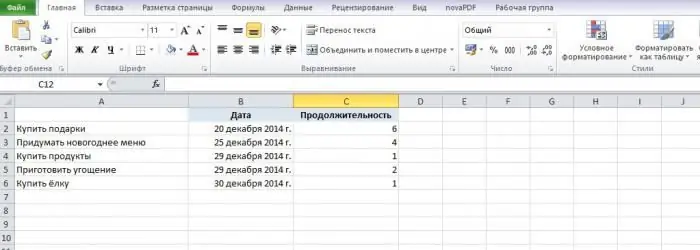
In order to build a graph, we need the following data:
- coordinates of all data sets (where each of the columns should start);
- name of each stage;
- duration of each stage.
For convenience, we enter them immediately into the corresponding fields of the table. After we have entered all the required information, we can proceed to the creation of the chart itself.
Important: make sure that all data formats areare correct: in particular, this applies to dates.
Step 2. Formation of the layout
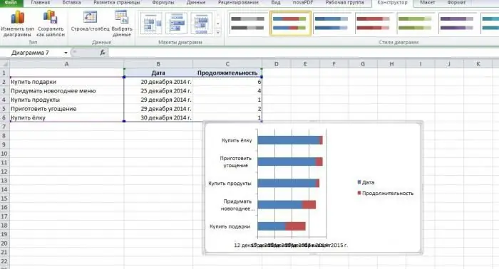
So, we know the purpose of planning and the key data on the basis of which we will build a schedule. Now in the spreadsheet window, we need to go to the "Insert -> Chart" section, and then click on the "Line" item. We do not need the usual, but with accumulation, since only it provides for the second row of data, which in our case will be the main one.
Step 3. Erase everything else
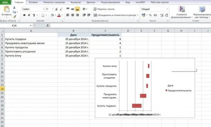
In order to do this, the program provides special tools. On the chart that appears on the screen, you need to move the mouse cursor over the blue bar, right-click on it and select "Format Data Series" from the menu that appears. A window will be displayed in which we need to go to the "Fill" item and select the "No fill" item. After that, the chart will look like this:
Step 4. Finishing touches
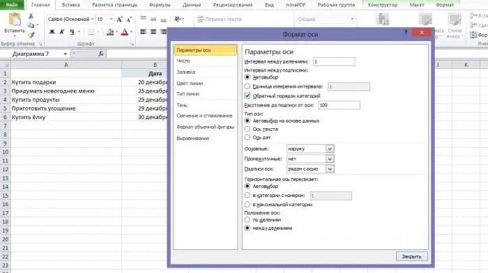
Since by default all the data in our graph is in order from bottom to top, we will have to modify it a bit. To do this, we right-click on the category axis (the one next to which we have a list of tasks), go to the "Format Axis" window. The tab we need immediately opens - “Axis parameters”. Check the box next to "Reverse category order". In fact, the Gantt chart is already ready, there are only a couple of useful little things left.
Step 5. Formatting
So, we continue to work on the chart. As you can see, it still looks unsightly, and now we will fix it using the spreadsheet itself:
- Stretch the chart to the desired size using the arrow in the upper right corner.
- Select all the dates in the table, click on the selection area with the right mouse button and go to "Format Cells-> Number". This section introduces the main number formats we work with. So that the inscriptions do not overlap each other, we advise you to choose a shorter version of the entry. Then, again, right-click on the axis with dates on the chart, select "Format Axis -> Number" and check the box next to "Link to source".
- Select the legend (the symbols "Date" and "Duration" on the right) and press the Delete button on the keyboard.
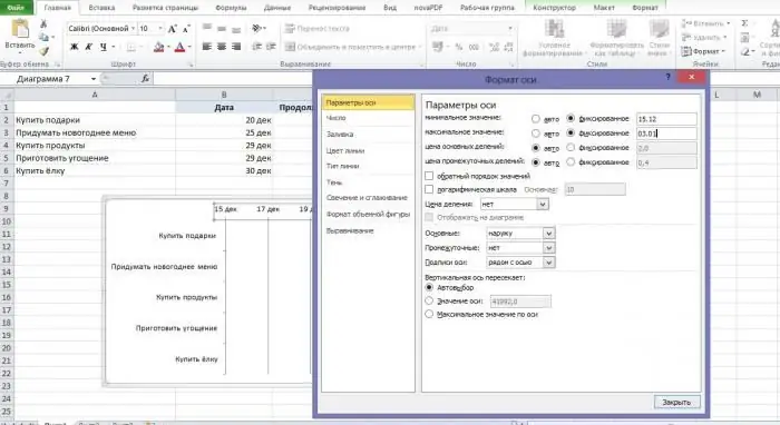
- Open "Format Axis -> Parameters" and set the minimum and maximum values (we set December 15, since it's Monday, and January 3). Here we can set the price of the main divisions (this is convenient in cases where, for example, work on a project will last several weeks or months). In our case, it is more convenient to leave the default value (2.0).
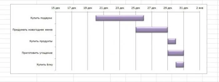
A little more experimenting with formatting - and that's what beauty we get in the end. Here is a finished Gantt chart. The example we have given is, of course, very simple - but it is enough to understand the essence of this method of planning andvisual demonstration of the process of performing certain tasks.
Other charting programs
Of course, there are many other, better programs that make project management easier. A Gantt chart of any complexity can be easily built using applications such as:
- SchedRoll;
- Gantt Designer;
- Mindjet JCVGantt Pro;
- Microsoft Project and many others.
In addition, there are a number of online services that provide their users with the opportunity not only to plan their affairs, but also to receive regular reports, notifications about the current status of tasks by e-mail. However, one cannot deny the fact that the confidentiality of data stored on the network is at risk, and stationary software that is installed directly on the user's computer, as a rule, has much wider functionality and is more reliable in operation.
Advantages and disadvantages of the method
Finally, it is worth considering in detail the main advantages and disadvantages of the described planning and management method.
The main advantage, no doubt, is the graphic presentation of the material. As a rule, it is convenient for businessmen to work with Gantt charts - they like the ability to clearly identify and designate the stages of work on a project. By presenting tasks in the form of different colored bars, all team members can literally identify their tasks at a glance.
It should also be noted that Gantt charts arean excellent presentation tool that is able to demonstrate the key priorities of the project. That is, as soon as the leaders allocate and distribute each of the available resources, the team instantly learns about it and follows further instructions. This feature of the Gantt chart is extremely useful for senior managers - using it, it is much easier to prepare a detailed, capacious report on the status of various projects.
However, like any other planning method, the Gantt chart has its drawbacks. One of them is task dependency. Quite often, in the process of presenting projects, managers need to show which of these tasks are related to each other. But, unfortunately, the chart format itself does not allow this. In order to get around this limitation, managers resort to various tricks: for example, they add special vertical lines to the chart that demonstrate key dependencies. However, this is only a temporary solution, unable to convey the information in full.
Another disadvantage of Gantt charts is their inflexibility. Nowadays, projects are not static - they constantly undergo some changes, shifts, which it is simply impossible to take into account in the diagram. Before starting to build a graph, managers have to calculate everything to the smallest detail, because with the slightest change in the estimate, the entire diagram must be redrawn from scratch. And that's not to mention that being able to illustrate several different ways of planning at one timealso missing.
Regardless of why you need a Gantt chart, a program (even the most "advanced") will not be able to display the significance and resource intensity of certain works, their essence. Therefore, it is rarely used for particularly large-scale projects.
Nevertheless, it is impossible to deny that this method is extremely common in project management practice - for more than a century of its use, people have had the opportunity to verify its efficiency and high efficiency.
Recommended:
Planning and economic department: its functions and tasks. Regulations on the planning and economic department

Planning and economic departments (hereinafter PEO) are created for the effective organization of the economy of organizations and enterprises. Although often the work of such departments is not clearly regulated. How should they be organized, what structure should they have and what functions should they perform?
Forecasting and planning finances. Financial planning methods. Financial planning in the enterprise

Finance planning combined with forecasting is the most important aspect of enterprise development. What are the specifics of the relevant areas of activity in Russian organizations?
Assistant is an assistant to a highly qualified specialist. Activities of an assistant

Assistant is a person who helps a highly qualified specialist in work or conduct certain research. But in what areas such employees are in demand?
Building a Pareto chart. Pareto Chart in Practice
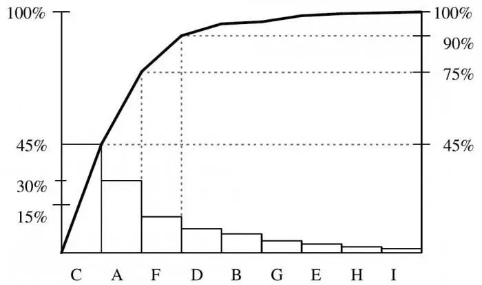
No one wants to waste energy. We are striving with all our might to improve efficiency: ours, subordinates, enterprises, equipment, after all. And it doesn't matter at what cost we achieve it. One of the simplest and most understandable methods for evaluating efficiency is the construction of a Pareto chart
The Chart of Accounts is Instructions for using the Chart of Accounts

Chart of accounts is an integral part of the accountant of any organization. It is noteworthy that in some cases an enterprise may use accounts that are not included in the main document. But mostly accounts are used that are spelled out in the work plan of the organization

